Tutorials
Create a sci-fi background. Part 3.
Oct 18th 2005
|
Create a Sci-Fi Background:
|
 |
1.
That's No Moon...
If you've followed the story so far, then you're aware of how one Halloween in 1999, Mr. Photoshop and his son dressed up as Jedi Knights and allowed themselves to be photographed. I thought I'd use those images to do something clever in Photoshop, but it took over 2 years to find the free time.
In Make a Good Selection you saw how I selected myself (don't knock it if you haven't tried it.)
In Create a Light Saber Blade you saw how I made toy light sabers come to life in the hands of two Jedi wanna-bes.
If you've been around since Correcting Scans With The Levels Command then award yourself a prize. You know too much! In that, I vowed never to choose "matte" finish at the local film processor's (since the quality is poor) and showed you how to correct a poor scan.
Which leads us to the present. I had these too reasonably cool looking Jedi outlined, but no back ground to put them in. |
|
|
2.
With Apologies to...
In college, I once saw the author Kurt Vonnegut speak. He began by explaining how he had learned in some class that a speaker should never apologize to his audience. But, he reasoned, perhaps an audience might enjoy being apologized to, so that's what he did. Which is my way of getting to this statement- I'm a little out of my league on this tutorial. There are computer illustrators out there who do great, convincing work, and I'm not one of them. But I had to try, and I thought you'd enjoy the results.
I originally thought I'd be done after I finished the last tutorial- the one with the light sabers. I was going to put the images on a T-shirt for my son, and I came up with a brilliant solution for the background. I'd throw in the Star Wars DVD pause it, and take screen shots of scenes I wanted. Then I could actually put my son & I in the movie!
Well it was a good idea, until I found that the disc has some sort of copy guarding which prevents me from capturing images from it. So after my disappointment wore off, I became intrigued by the idea of trying to create my own 'space ship' background- completely within Photoshop.
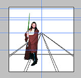
I started by pasting my previously selected self into a new file and using guides (those blue lines- just drag them from the rulers) to establish the horizon line (right out at my shoulder height) and a few other features. I drew lines for what would eventually become the floor. You can use the line tool for this, or a painting tool, like the pencil. To draw a straight line with a painting tool, click once at the origin, then hold down Shift and click a second time where you want the line to end. Presto! Straight line! |
|
|
|
|
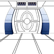
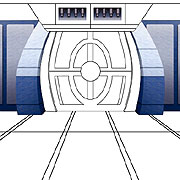
3.
Basic Layout
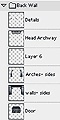
Just a short while later, I've completed drawing all the lines I think I'll need to establish this environment. I used the Pen Tool  to draw smoothly curved paths to make the shape in the door and the archway sides. I stroked the paths to get lines and tried to keep most elements on their own layers. to draw smoothly curved paths to make the shape in the door and the archway sides. I stroked the paths to get lines and tried to keep most elements on their own layers.
Though the scene is obviously based on a background from the film, I also wanted to feel free to use my own ideas. So when I started adding detail & colors, I did whatever I felt like. It's not that I felt I could do better than what was in the film, it's just that I wasn't going to spend an eternity on this, and simply trying to reproduce someone else's ideas didn't appeal to me.
|
 |
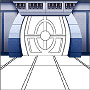
4.
Filling the Shapes
I've started to fill in more of the background here. Since the scene is symmetrical, I would frequently create just once side of the scene, duplicate that layer, then choose Edit: Transform: Flip Horizontal and put the piece in place on the opposite side.
As for filling the shapes, remember I had those lines on transparent layers. I made a copy of the lines merged against the white background, then used the Magic Wand  to click and select an area. I'd then expand the selection a little (Select: Modify: Expand) because I didn't want the lines to show too much in the end. to click and select an area. I'd then expand the selection a little (Select: Modify: Expand) because I didn't want the lines to show too much in the end.
I once wrote a tutorial called Defining and Using Patterns. In steps 3-5 of that classic I showed how to use the Add Noise and Motion Blur filters to create a somewhat metallic texture. I used that method to fill the shapes you see done here so far. In these small JPEGs you can't really see it much but look for it in some of the detail shots later on. |
|
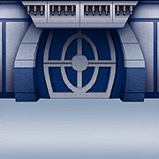
5.
Noise & Blur
Here I've filled in the top section and added some shadows. I was trying to make this thing look as realistic as I could without devoting several weeks to the job and here are a few of the methods I used: Once the shapes were filled in with the texture & color I wanted, I'd try to 'dirty' them up a bit. Real photographic backgrounds have a ton of messy detail to them and a quick way to mimic the 'grit' of reality is to use Filter: Noise: Add Noise.... Whenever you've got some airbrushing or any area that seems just a little too smooth and clean, adding noise can give it a bit of realistic texture. Following this, I used Filter: Blur: Gaussian Blur... to blur up the noise just a little.
|
 |
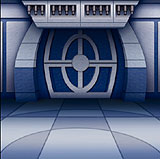
6.
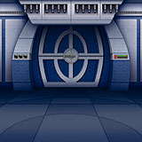
Styles & Gradients
Well, nearly everything is filled in now. For the shapes on the door, I kept the similarly colored areas on separate layers and let Photoshop's Layer Styles help me make the area look three-dimensional. I used Bevel and Emboss with a Direction: of Up for the light blue areas and the same style with a direction of Down for the dark blue sections.
I also experimented with overlaying gradients  on the individual areas. That's most evident here on my preliminary 'floor'. I used the Copper Gradient on a layer above the floor and chose a Blend Mode of Overlay. on the individual areas. That's most evident here on my preliminary 'floor'. I used the Copper Gradient on a layer above the floor and chose a Blend Mode of Overlay. |
  |
7.
Shadows
While you can see in the image that I've started to work on the floor, I'll take this opportunity to talk about how I created the shadows. You can see them everywhere, and for the most part all I did to create them was apply a gradient on its own layer and lower the opacity.
Take the area below that protruding top section for instance. I kept all the major wall elements on their own layer (notice them grouped into a layer set) so it was a simple matter for me to load the selection of the door; make a new layer above it; and put a gradient on that layer. The linear gradient I used was Foreground to Transparent and my foreground color was a very dark blue or black. Then I might choose a blend mode other than Normal for the shadow's layer (try Overlay or Multiply) and I lowered the Opacity of the layer until I thought it looked right.
Having the pieces of the background broken down on individual layers allowed me to create all the shadows you see one at a time so the scene looked a little more 3-D. |
 |
8.
The Floor
I was getting a little tired of the whole thing by this point and the floor doesn't really reflect how I thought it would end up. Notice I darkened the whole thing compared to Step 7 above. I was planning on doing a reflection and I figured that would end up hiding a lot anyway.
Before tackling the reflection, I made a layer of all the pieces merged together (Edit: Copy Merged) and did the old Add Noise/ Blur trick on all the elements together (see Step 5).
I'm sure you've noticed the addition of small details on the door, arches, and top wall. Let's look at those: |
 |
9.
Details
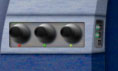
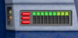
Adding these tiny details really went a long way toward making my Sci-Fi background look a lot more believable and not so barren. Yes, they took a while, maybe 20 minutes apiece. But basically, I just drew the shapes using the rectangular & elliptical marquees, filled them with a greyish texture, and used linear gradients (as in step 7) to create shadows.
Notice the small narrow control panels on the inside of the arches. These began as an altered version of the panel in the top right image, then I used the Edit: Transform commands (Scale; Perspective, Skew; & Distort) to make them look as if they are seen from the same angle as the inner side of those arches.
The light were created by filling small selections with color, then making a small glow in a manner similar to what I did in the '"light saber" tutorial. |
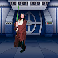 |
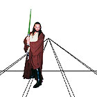
Interlude.
Well,
so far so good. Though this scene is far from photo-realistic, it
was fun to do in the time I felt like devoting to it. Here, I've revealed
the layer with myself on it again, just for reference- to see how
things are going and get an idea of how it might look when finished.
But before I'm done with this background, I've got to tackle the dreaded reflection that we'll see in the floor.
Have you caught your breath? Great, lets go on. |
 |
10.
Mirror, Mirror...
Adding the reflection on the floor involved duplicating the layers of individual wall pieces and flipping them appropriately (Edit: Transform: Flip Vertical). Why couldn't I just flip the whole thing at once? Because area where the wall elements meets the floor is not a straight line. |
 |
11.
Problem Areas
Here's one of those areas that created a challenge. On the front side of this arch the reflection simply involved flipping and placing the element.
On the inner side, however, I had to select the area and distort it (Edit: Transform:) until it matched up with its upper mate. This of course altered the whole curve on the inside of the arch and I had to use the Pen Tool to draw a new curve that looked right.
That wasn't too tough, but I was in for a plethora of this kind of problem when I got around to doing reflections for the people in the image. |
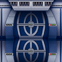 |
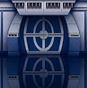
12.
Finished?
It wasn't too bad of a time and I've got everything matched up pretty good.
A few words about reflections here:
I show in this image a reflection as realistic as I felt like managing. The reflection goes "straight down" into the floor. Another type of reflection you can do is one that looks like it's lying flat on the floor. To do that, you use Edit: Transform: Perspective to create the 3-D effect of the reflection getting larger as it comes nearer to the viewer. Most of the time I do them this way, because I like the way it looks- compositionally, it works better; drawing the viewer into the image. But that "perspective" type of reflection is stylized- not realistic. I tried it that way briefly, but I thought I needed this image to look more real. |
|
13.
Gradient Overlay
 Here you can see how my merged reflection layer looks. Notice I've added a Layer Mask and put a gradient in it so that the reflection is darker and more muted than its source (the wall). You're not leaving now, are you? Really, you've got to see how it turns out. In the final chapter of this epic, I'll put in my two Jedi figures (and more) and go about creating believable reflections for them. Read on for: Creating Complex Reflections. Here you can see how my merged reflection layer looks. Notice I've added a Layer Mask and put a gradient in it so that the reflection is darker and more muted than its source (the wall). You're not leaving now, are you? Really, you've got to see how it turns out. In the final chapter of this epic, I'll put in my two Jedi figures (and more) and go about creating believable reflections for them. Read on for: Creating Complex Reflections. |
|
|
Latest Forums Clone YourselfThat is quit nice. But I think that can be more easy to do.. |
